


Art Materials: Favourites of 2024
2024 was a 'low buy' materials year

Hello Friends! If you’re new here, I’m Raj Kaur - Designer, Artist and Illustrator, and on my Substack I share Process, Play and Projects related to the intersection of my personal work and my professional career as a Designer. Welcome! I made a shiny new Contents page - head over there to find everything easily.
This post is an annual tradition (can you call it a tradition when you’ve only done one before?! Let’s say yes.) It’s the 2024 version of this post from last year. You’ll notice a lot of similarities! That is a good thing, as I made a point of restraining my art purchases. I got a couple of new things, but I mostly wanted to just feel really proficient with the lovely stuff I already owned.

As a Designer for Brands, so much of my time is spent creating work on screen. So for me, time with my traditional art materials is golden time. I have a good stash of supplies which I have built up over recent years. I’m always tempted to buy more, but I wanted to have a low-spend year. Not because there’s anything wrong with buying art materials - quite the opposite! Life is short, BUY THE MATERIALS. The thing is, you have to USE THE MATERIALS. My conscious focus and desire was to really get GOOD with the materials I already had. I set myself some specific guardrails for my personal creative practice:
2024 areas of focus:
I focussed on COLOUR. This is where I leaned into paint. There are 4 paint palettes that I moved between, some for mixing, some for the colours straight from the tube, to allow me to explore colour palettes. I bought one new set of paints, everything else was already in my stash. I’ve kept a separate sketchbook for all my colour exploration. (Deep dive video coming soon for the paid folks).
I started my Free Co-Swatch Sessions. I realised that so many of my previous materials were left un-loved, or were being ‘saved’ because they were special, and I simply didn’t make the time to get to know them. Rather than buy more, I promised myself I would use these sessions to really get to know them. This has pushed my colour palette discoveries forward SO MUCH, and re-kindled my love for previously neglected materials. If you’re new here, you might enjoy this little video.
I leaned into the materials that felt ‘easy’. I have always loved ink. The immediacy of it, the strength of colour, and the variety of ways you can make marks with it. I extended my range of colours this year, but I was still very restrained, and made sure only to get 1 or 2 new colours that I knew would complement my existing colours, so I would have a harmonious palette.
Stopped using the stuff I hate. Honestly, I can’t bear soft pastels. The dust, the scratchy feeling, the messy fingers. However, I LOVE oil pastels. The intense colour, the creamy texture, the bold marks. It’s time to gift the soft pastels to someone else, and make space for one or two really lovely oil pastels.
Leaned into the sketchbooks I love. This was where I was at the start of 2024 with my sketchbook obsessions. (Should I do a 2024 version of that post too!?) Half way through 2024, I went all in on Pith Supply sketchbooks. I’m obsessed with them. It’s time to say goodbye to my Royal Talens Art Creations. I tried to use up some half finished ones from ‘23, but I think I’m just going to abandon them and be done with it. It’s OK to liberate yourself from sketchbooks that you no longer love!

So here were the most hard working materials for me in 2024 (numbers align with the image at the top of this post.)
Jaxon Oil Pastels – Cheap as Chips, low quality, but SO much fun and a surprising range of great colours. I bought the box of 60 - they are my gateway to a higher quality brand, but I’ve LOVED playing with them.
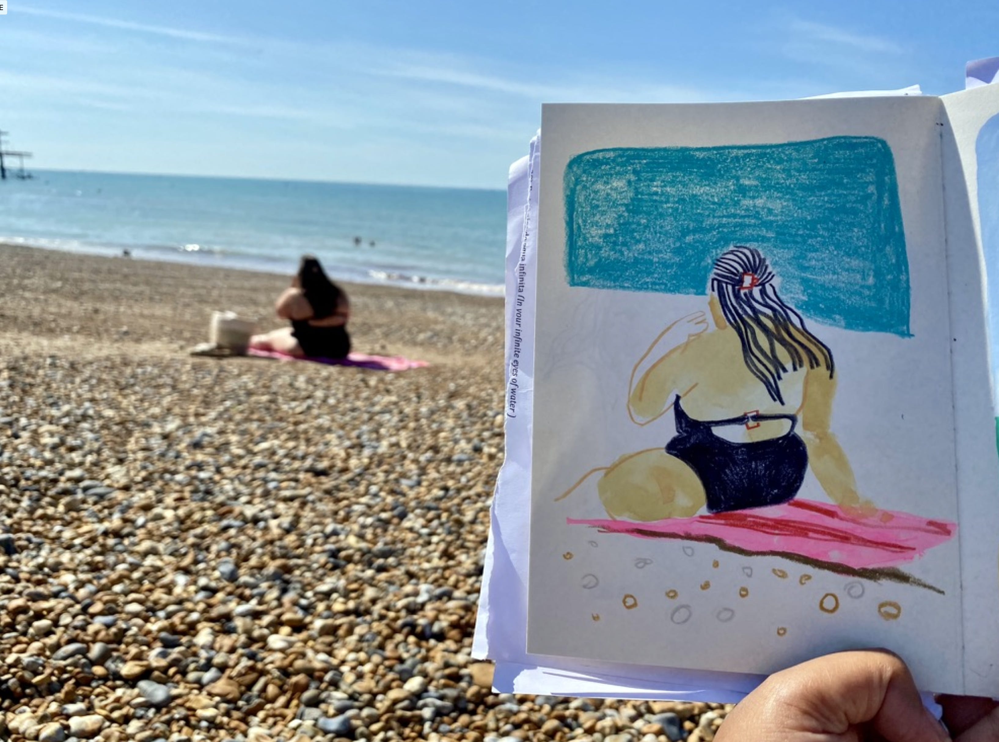
Caran D’ache Neocolour 2’s – I have not purchased ANY new Neocolours in 2024. This limited edition cool and warm set is still available here! I have been using what I have a lot, really enjoying the beautiful pigment both wet and dry. It was great to travel with the Cool and Warm sets on my trip to Brighton this year. Hardworking, great ‘portable paint sticks’.
Holbein Artists Gouache - Spring palette. This was a rare treat purchase which I managed to get with a great sale discount. I dived into Frances Ives Patreon materials posts to help me choose which set I wanted. NO REGRETS. Stunning selection of colours that mix into more gorgeous colours. I’ve already filmed this materials video, and I’m excited to film an update a year on. (paid subs).
Japanese Gansai Tambi Spring Palette – see a theme yet? My birthday is in April, which explains my obsession with this season and its colours. This palette was a gift from 2 birthdays back, and I have really given it some love this year!
Caran D’Ache Gouache Studio – LOVE LOVE LOVE. If you’re a gouache purist, you may not like this. However, I ADORE it. This is my second year of using it now, and the large red tin brings me so much joy. Make sure to allow the pans to soak up some water before using it, to really activate the paints to get the best out of them. When you do, you can mix a brilliant range of colours, as it has both warm and cool primaries plus additional mixing colours. Buy some extra white gouache and you’re good to go!
Ink brush pens, various brands – I’ve had some breakthrough sketches using these. I love the textures you get with them, how easy they are to work with and how convenient. I feel like I really know how I like to use them now, so I will be investing in a lot more colours this year. Sarah Dyer has just made a brilliant deep dive video into brush pens on her Patreon - SO informative, go check it out.
Pentel Brush Pen –much loved for many years now. Remains a workhorse, must-have pen.
Mitsubishi Uni-ball Eye – THE ONE PEN TO RULE THEM ALL. Everything I need to write is written with this. Also, GREAT for drawing. I just wish it was refillable!
Most used Pencils – Palomino Blackwing Pearl, Derwent Drawing Mars Black, Luminance Paynes Grey 508, Middle Cobalt Blue 660 and Pthalocyanne Blue 162, Holbein Luminous Red and the Cretacolour Megacolour Permanent Red Light (desperately looking for this to purchase as a single!)
Brass pencil sharpener – this is still the most reliable sharpener I own. I include the green one in the photo, but it’s still not as good at the brass. Plus it feels so beautiful in the hand.
Bamboo Dip Pen – my trusty companion for over 12 years now. Seasoned with years of ink, it is one of my most treasured possessions and makes the most gorgeous lines. If you buy one, be sure to soak it in water for 20 mins before using with ink. Softening the wood this way will allow it to soak up ink better, and give juicer lines.
NEW ITEM ALERT!!!!!!! Kakimori Steel Nib & Dip pen – this was a Christmas gift from my husband this year and it is DIVINE. I’ll be sharing a deep dive materials video on this for paid memebers because it is just WONDERFUL. Have you seen this time lapse of of me using it?
Parker Quink ink – lovely stuff, although I think once this bottle is done I shall upgrade to only using inks that are lightfast. This is highly fugitive, so tread with care.
The rest of my lovely inks – Sketch Inks (various colours), Noodlers Ink (Peach), Rohrer’s Antiktusche Blauviolette and the Pilot Iroshizuku ink. I shared my love for all of these in my October deep dive and inks posts. Ink’s remain a deep love, and I’m excited to explore them with other materials this year.
Art Graf Tailor Shape in Blue – an impulse buy, I LOVED the varied marks, textures and intensity of colour you can achieve with this. Messy when used as a crayon, but can also be used with a brush as a paint block. Really versatile.
Upcycled Mini watercolour palette – I had a beautiful old metal eyeshadow palette from Mac Cosmetics that I bought back in 2001. Somehow, it was still knocking about. So I washed it out and filled it with tube watercolours. It fits into any pocket, and can be attached to a sketchbook with a bulldog clip. I LOVE IT. I was inspired by a Patreon post by Victoria Semykina. Go to her brilliant Patreon for more great ideas of how to create great travel kits.

Looking ahead to 2025 areas of focus:
MORE INK. I will continue to lean into what feels easeful, joyful and expressive, and inks give me that. I’ll be reaching for bigger brushes and more varied mark making.
Colour Colour Colour! I’ve learned SO MUCH this year with my focus on colour. The plan is to keep going with more of the same. See you at the Co-Swatch Sesh!
Paint more – this has felt like a re-discovery this year. A way of accessing my inner child in my sketchbook. I don’t feel ready to bring paint into my projects yet, but I will continue to have fun with it for myself.
Bold lines with Oil Pastels. I have so many ideas of how I want to combine ink and oil. I want to get messy! I’m excited to see where this goes, and I will be exploring this under projects planned for this year.
Scale. I was surprised with how much I loved working small. I also want to explore working bigger. Playing with scale can be such a game changer!
📚 Did you know that many of my sketchbook tours are accessible here? Go grab a drink, and take a look!
✨Have a look at everything I’ve been cooking up for the last two years on my new shiny Contents page!. ✨
🎧 I was invited to be a guest on the The Creativity Cafe Podcast in November. It was such an easy, relaxed and fun conversation. Go listen!
👷♀️ I’m ready to MAKE STUFF this year, so I created ‘5 Projects for 2025’ where we’ll work through projects to a brief, together. Find out all the details here and here. Want to get to the end of 2025 with 5 new pieces of work? JOIN US!
I’d love to know, what were your TOP 3 most used materials of 2024?
(Also if you have any questions about Project 5 for ‘25, go ahead and ask in the comments below ⬇️)
I was just about to record a video with my own favourites of 2024, and then I saw this post. The Kakimori pen 😍 A thing of beauty, even before you use it! You might change my mind this year about my current favourites 😅
The numbers in the image are super helpful. Thanks