


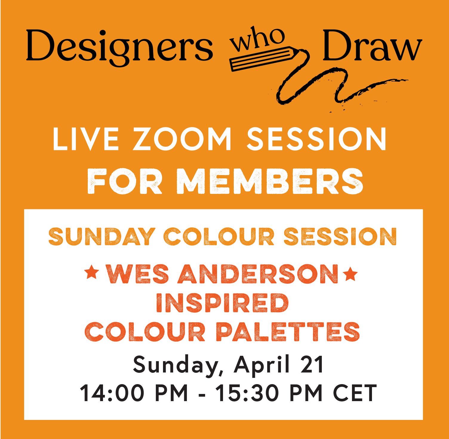
LIVE Sunday Colour Session: Wes Anderson inspired palettes
LIVE Sunday Colour Session: Wes Anderson inspired palettes
This weekend!

When I’m struggling to find a fresh way into working with colour, I find it really useful to look to film and music for inspiration. Wes Anderson is masterful and very particular with his use of colour - but how can we find surprising combinations for our own work?
We will work from some of his iconic scenes to create colour studies.
Portfolio pieces
When building your illustration portfolio, including images which show how you would interpret iconic movie scenes is a great way to:
Demonstrate how you work with colour: simplifying the scene but interpreting it into your way of working with colour. If you are a watercolour master, how would this scene look in your style? Would you work in watercolour layers and pencil line on top? Perhaps you work in a bold, expressive way - simplifying the main colour blocks into simple shapes?
Portraits: The actors faces are all well known and iconic. How do you render the face to capture the mood / essence of the character? These examples are always useful for demonstrating your portrait skills, and help to showcase your potential for commissions.
Narrative: The scenes are built with wonderful props and little objects to suggest the story, setting and a sense of place. As an artist, you select what you choose to include or exclude to tell your version of the story.

In the session:
I will have 4 stills for us to choose from. Work quickly from all 4, or select one to focus in on.
The images will be in colour and black and white, so we can look at the tonal values as a way of simplifying what we see
Below the fold ⬇️ I have attached the reference so you can prep the colours beforehand, or just come along with a range of materials and use this as a play session. Perhaps you’d like to prep some paint mixes if you want to work with wet media.
I will have my overhead camera showing my process as we work and chat.
Bring whichever materials you feel most comfortable working with.
Sign up link below the fold. ⬇️
See you soon!